It's been about a month since we officially launched our interactive market reports. So far, the feedback has been great. Here's a recap of our philosophy and approach to these reports...
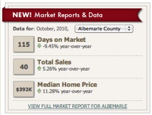
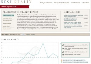
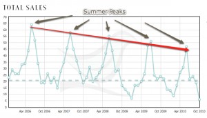
There are some services out there that pull real-timemarket data, turn it into graphs, and allow subscribers to post it. These actually work pretty well in bigger markets with a high volume of transactions. However, in the Charlottesville area where we do about 3000 (give or take a few) transactions per year, the formulas for those vendors don’t really work as well. Along those lines, we get a lot of requests for up-to-date market statistics. How many sales have there been month-to-date? What’s the median price? We spend a lot of time checking the stats and staying on top of the Charlottesville area real estate market so that our buyers and sellers are informed…but we wanted to be able to provide you with a monthly market snapshot of some of the most requested market info. Here’s what we came up with. We think it’s pretty sweet and we hope you think so to... Now for a brief overview: We broke Central Virginia down into the 5 major Counties (Albemarle, Nelson, Greene, Fluvanna, and Louisa) plus the City of Charlottesville. For this Beta version, we’re just analyzing single family homes (so condominiums and townhomes are not included in these reports). In addition, the data is pulled from our data feed about the 2nd week of each month – this way we can ensure that the data from the previous month is as up-to-date as possible. On the Nest Charlottesville homepage, you can select a City/County to get a quick snapshot for the current month. The snapshot will give you the market stats, but will also show you the year-over-year change from last year…enabling you to deduct the current market trends. Want more? We’ve got it. Go ahead and click on the View Full Market Report link... Once again, at the top, you can toggle between Counties and get a description of each area. Below, there are three charts with descriptions on the sidebar for each: 1. Days On Market 2. Total Sales 3. Median Home Price For each of these charts, you can toggle between Counties and choose to select a one-year, three-year, or five-year chart. No matter the chart, we’ve also included a dotted line to show you the average during that period. Why? Perspective. It will enable you to see not only how we are trending, but also what’s been normal (if there is a normal) during that time period. So let’s take a stab at some analysis. Here’s a chart for Total Sales in Albemarle County over the last five years: First of all, scroll over the small circles – it will show you the exact data points of the chart. Second, take a look at the peaks of each year – you can see how our market is cyclical…highs in the summer and lows in the fall and winter. You’ll also notice that the lows over the last several years have been considerably lower than in 2006, 2007, and 2008. The peaks, on the other hand, have been lower, but less erratic. Lastly, you’ll see a clear downward trend in total sales over the last five years (the red line). Obviously, we wish the market were a bit better.


Comments (0)Subscribe to CommentsComment