Special offer

Paint the Town Red or better yet Sedona Clay...

By
Home Stager with Fusion Design Consulting

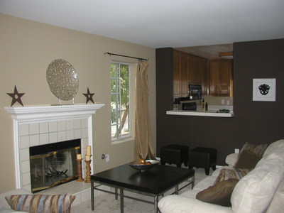
LR BeforeLR afterChoosing paint colors for the interiors of an entire house can be very stressful.  On Color Consultations for empty houses I recommend beginning with a neutral color throughout the house and then adding an accent wall(s) in darker colors.  Painting bedrooms in different colors adds so much interest to the house and allows variety without being overwhelming. 

When sellers are repainting their houses prior to listing I choose a neutral theme of only three colors.  The exact paint color scheme is selected depending on floor color and other architectural elements (fireplace surrounds, cabinets, tile etc.) and the style of the house.  For the main color I use a neutral hue-usually a golden or taupe tan.  For one or two accent walls I use a darker coordinating shade of gold or brown or clay.  I use a lighter tint of the main color for the bathrooms and kitchen.  These color schemes give the house interest and drama without being distracting.  This also gives buyers a great starting base to add more colors as they choose.

I always use an eggshell finish because it is easy to clean and reflects light well helping to brighten rooms.  Flat paints are best for hiding flaws in the walls but they absorb light, which can make rooms feel darker, and they are hard to clean.  Pearl finish has a low sheen and makes colors brighter and more intense, I like it for doors and trim. 

Painting your new home or repainting your existing home is much more personal.  As above you need to consider flooring colors and architectural elements when choosing colors, but you also need to consider your furnishings and linens and of course your personal preferences!.  You can use a rug, curtains or bedding as a starting point.  By picking up color cues from the furnishings in the room you will create a complementary and balanced palette.  I still recommend choosing a main color scheme for the main living areas, hallways and bathrooms.  This gives a sense of continuity and balance.  Kid's rooms are a great opportunity to have fun with livelier colors.  The Master bedroom and guest bedrooms are best in soothing tones. 

Color groups are referred to in terms of temperature.  Reds, oranges and yellows are considered warm tones and add intensity and energy.  Greens, blues and purples are considered cool colors and have a calming effect.  Brown (Hasbrouck Brown) and orange (Sedona Clay) are strong warm color examples great for accent walls.  Steel blue (Van Courtland Blue) and gray (templeton gray) are excellent colors on the cool side of the color wheel, great in bedrooms. These are all Benjamin Moore.

Prior to choosing the final colors it is really important to get quart paint samples mixed (Benjamin Moore also sells 2-oz paint samples in a variety of colors)and paint large swatches on the walls in various rooms.  Check the colors in different lights throughout the day and in artificial light at night.  

Lastly, I really believe that paint colors need a week to get used to.  Once painted, the rooms will pull together and make sense. While you are choosing colors you tend to focus too much on the contrast of the existing color and the new color. Once completely painted this contrast will not exist and the wall color will become a harmonious background for your living spaces.  


Janice Sutton
1st Stage Property Transformations - Murrieta, CA
Home Stager - Temecula Murrieta
Great paint blog Gina.  I also like to tell clients that the wall with the window on it is the darkest wall since light may not be hitting it.  So when choosing a color put it on the wall with windows(darkest) and put it on the wall across from the window(lightest).  You will see how different the same color can look on opposing walls.  Stage it Forward!
Dec 08, 2006 04:13 AM
Kimberly Wester
Valparaiso, IN

Hey, Gina,

Great advice.  Especially the three color theme.  I have heard of some "colorists" who recommend a different color for every room and that makes me wonder if they are getting paid per.

I ditto your advice, with one exception.  I really like Behr paint (available at home depot) because they have a new product called "Flat enamel" that has a flat finish -therefore hiding drywall flaws and softening the lines - but it is very durable and truly scrubbable.  I use it in my house and LOVE it!  With two kids and a dog, there is a lot to clean up and I haven't found a stain too tough yet, plus the color does not fade when you use the magic eraser.

When I work with painters, they prefer Lucite because it is less expensive, but I cannot say I have been as pleased with the results. 

*I am in no way associated with Behr paints:)*

Stage it Forward!


Dec 08, 2006 11:40 AM
Gina Dougherty
Fusion Design Consulting - Redondo Beach, CA
Home Staging Redondo Beach, CA- FusionDesignConsulting.com

Hey all- Thanks for sharing your tips and preferences!  Color is so great and it really suprises me how many people are AFRAID of it. 

I should add I'm not affiliated w/Benjamin Moore!  Although they do give a designer discount...


Dec 08, 2006 12:02 PM
Phyllis Pafumi
ReStyled to Sell Home Staging New Jersey - Old Bridge, NJ
ReStyled to Sell Staging Homes NJ

Hi Gina

This is great advice and I just love the dark accent wall. I just recently staged a home where I did a dark terracotta, it was call Mexican Red on 2 walls in the kitchen to draw your eye up because  this small kitchen had a vaulted ceiling but you really did not notice it because the kitchen was blah.. This was a little scary, but when the homeowner came up the stairs and looked in the kitchen and said WOW..I knew success!! The open house is this weekend and I am anxious to see what happens..

Phylis Pafumi 


Dec 08, 2006 02:03 PM
Maureen Maureen
Orangeburg, NY

Gina - Wow great B&A.  I love the color choices and the accent wall.  I checked out your website.  LOVE the exterior of the house one.  At first I didn't think it was the same house.  It is amazing what pruning the trees and a coat of paint can do. 

You go Girl!

Dec 09, 2006 05:21 AM
Jeff Turner
RealSatisfied - Santa Clarita, CA
Gina, I was attracted to this post by the title. I love the color scheme and the transformation. And this advice - "When sellers are repainting their houses prior to listing I choose a neutral theme of only three colors" makes so much sense to me. The same thinking holds true in graphic design. You can pick out the amateurs by the number of typeface families they use on one page. 
Dec 09, 2006 08:30 AM
Kimberly Wester
Valparaiso, IN

Jeff-

Your comment about the type face made me laugh.  Our former church hired a secretary once that changed the typeface for every announcement.  Looking at the bulletin gave me a headache...

The same holds true for color.  If you can stand in one place and see a bunch of different colors all at the same time, it's just wrong.


Dec 09, 2006 09:15 AM
Jessica Hughes
Ambiance Staging - Boulder, CO

I've bookmarked this post, thanks for the painting tips.

I believe in using color though, and love accent walls.  I almost hate to see a home painted all white more than one with bright colors. 

Dec 11, 2006 05:36 PM
Anonymous
James

Thanks for the tips. You wrote, "For the main color I use a neutral hue-usually a golden or taupe tan.  For one or two accent walls I use a darker coordinating shade of gold or brown or clay.  I use a lighter tint of the main color for the bathrooms and kitchen." Care to share which paint you are using- I would love to see some samples if I had the identifying numbers/ brand.

Have you used Better Homes and Garden paint software called Picture Painter. It allows you to scan in photos and try out different paints for walls, trim, cabinets, etc.?

Dec 16, 2006 05:11 AM
#11
Gina Dougherty
Fusion Design Consulting - Redondo Beach, CA
Home Staging Redondo Beach, CA- FusionDesignConsulting.com

Hi James, I always use Benjamin Moore.  The color scheme in the post pics are Greenbrier Beige (HC-79) as the main color, Cream Fleece (233) as the lighter tint and the accent wall was HC72 Branchport Brown.

The Golden colors I like are Desert Tan as the main color (2153-50), Rich Cream for the lighter one (2153-60) and Cork as accent (2153-40), these are all on the same color card - very safe.  Sedona Clay 2174-30 really is a great accent too.

I love green but I have the hardest time finding a good shade.  I have never tried Picture Painter, but I will now-thanks.

Dec 18, 2006 05:22 PM
Karen Reynolds
Champagne Staging. LLC - Raleigh, NC
Greens are brutal.  I always see them in houses & love them but when its time to pick it out, it never works.  yesterday I got a Ben Moore golor called Guilford Green.  Looked sagey to me on the card.  I got it home, slapped some on the wall & it looked like melted mint ice cream - ew!!  needless to say I gave up on the green idea & am back to basic beiges....
Feb 04, 2007 12:03 AM
Home Staging
Reston, VA

Hi Gina - great post.  I use the colors you noted also.  I like a green called Salisbury Green, HC-139.  Take a look and let me know what you think.


Feb 04, 2007 01:19 AM
Gina Dougherty
Fusion Design Consulting - Redondo Beach, CA
Home Staging Redondo Beach, CA- FusionDesignConsulting.com

Karen, the very same thing happened to me w/Guiliford Green!  An ice cream shop is EXACTLY what I thought too!

Denise, thanks for the suggestion, I do like it on the fan deck, I wish it was available in a sample jar! 

Feb 11, 2007 02:45 PM
Anonymous
Katrina
I swear by BM Saybrook Sage - I had to choose a paint color quickly before setting up my fishtank in the main room when I moved, and I'm glad I went with my gut and chose that one!  It's very soothing and easy on the eyes!  I think I'll paint the bedroom the same color since there's lots of leftover paint.:)
Feb 06, 2008 07:20 PM
#16
Gina Dougherty
Fusion Design Consulting - Redondo Beach, CA
Home Staging Redondo Beach, CA- FusionDesignConsulting.com
I love color suggestions, green is especially hard to find- I'm going to try this one.
Feb 07, 2008 04:56 AM
Anonymous
Foqia

 Awesome! I love this painting post.


Regard

http://www.chelmerfineart.com

Jul 01, 2009 02:33 AM
#19
Anonymous
diana

I am having a horrible time finding a warm paint color for my home- not huge but all rooms are connected with a high ceiling and very little natural light.  Do you have a photo of Benjamin Moore Rich Cream?  I have tired 3 colors already- painting the entire room/rooms and they all turn dark gold or green.

Sep 25, 2010 05:02 AM
#20
Gina Dougherty
Fusion Design Consulting - Redondo Beach, CA
Home Staging Redondo Beach, CA- FusionDesignConsulting.com

Myperfectcolor.com is a site that shows Ben Moore color samples online.  Rich Cream is available as a pre-mixed sample at the store, as are many others.  My local store now mixes samples as small as 1 pint making it easy to get any color sample.  Another good one is windham cream- it's more yellow in person.

Rich Cream                                                   Windham Cream


Sep 25, 2010 05:56 AM
Anonymous
Julie

I'm thinking of painting my accent wall a coffee bean color in my living room. Would that color be way to dark? I have a tiki color in my living room now on all the other walls. It's almost a tan color with a very small tint of green. But again very small. And you said to make sure it's with an egg shell finish?

Jun 25, 2011 04:44 AM
#22
Gina Dougherty
Fusion Design Consulting - Redondo Beach, CA
Home Staging Redondo Beach, CA- FusionDesignConsulting.com

Yes, eggshell finish reflects some light and is easy to clean.  Coffee brown will be beautiful.  It won't be too dark if the room has a lot of natural light.  Hang a mirror to reflect more light.  Good Luck!

Jun 27, 2011 03:43 PM