Color is a state of mind. Reds represent warmth and even rage, while cooler colors like blue soothe emotions and calm the savage beast. Even social or cultural levels, as well as personal relationships and the state of the economy can influence what shades pass muster and those that don’t.
In “The Psychology of Color,” color specialist Pantone, LLC, notes that workers at a company voiced disapproval that an office painted blue was too cold. The company repainted the office a warm peach, and everybody felt less chilly, even though the room temperature wasn’t altered.
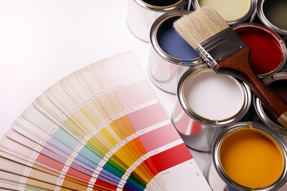
As property owners continue to find new ways to attract and retain residents, the 2015 color mind-set of interior paint design remains a steady driver in helping residents feel at home.
Today’s palette of popular home color choices generally follows expressive fashion and design trends with a little splash on the millennial demographic. Neutrals to spirited, “happy” colors are covering walls to reflect a forward moving generation that is all about a new direction.
“There are a lot of factors, drivers and influences when talking about color,” says Anne Diedrich, an interior designer at Sherwin-Williams. “The primary driver for those colors is the millennial demographic, in general, because that demographic continues to drive change. They are a large demographic and they have new and differently inspired vantage points. Because of that, they are influencing everything.”
Wall color is an extension of the resident
Demographics as a whole play an important role in determining what colors are best suited for a property, she said. Architectural style and community type, as well as building materials and decorative elements, should be considered when choosing interior and exterior color combinations.
Exterior colors are more defined and limited to geographic locations, Diedrich said, but interior walls should represent residents who live within them, the latest trends and company branding.
“You’re building brand awareness,” she said. “It’s important to take a look at demographics, and also the paint applications.”
Neutral color combinations are popular in rental arenas. Lighter wall colors are being matched with some neutral shades. For example, a clean white and contemporary gray is in style, Diedrich says.
Neutrals in grays and taupes offer a more elegant, upscale look
Sherwin-Williams, founded in 1866, works closely with home leasing professionals and offers color solutions that reflect current styles and trends from neutrals to brights.
The company’s Feature Wall Program enables residents to choose accent colors for their homes.
“It gives them a way to personalize their space and make it feel like their own,” Diedrich said.
Inside homes, neutrals in grays and taupes are being paired for a more elegant feel.
“It creates more of an upscale look,” Diedrich said of the color combination. “Maybe there’s one neutral wall color used in combination with another neutral from that same color family but slightly darker in value. You still have two neutral wall color selections, but it’s a tonal color combination. It just gives that unit a little more of an upscale feel instead of four white walls.”
As the economy gets spirited, so do color combinations
Like with other styles and trends, economic conditions can play a large factor on what gets splashed on walls. In today’s improving economy, brighter and bolder tints are more popular, Diedrich said. However, when markets tumbled in 2008-09 and America recoiled, the tone was different for home interior design.
In 2008, the Rohm and Haas Paint Quality Institute (PQI) endorsed drab and dark colors like greens, blacks and browns mixed with whites, silvers and reds. PQI said the colors represented environmental responsibility and a nurturing, caring environment. A year later as America transformed, PQI chose a palette of bronze metallic, dusty purple, deep blue and rosy pink that took a “cue from the continually changing skies” and provided “the homeowner with colors represented at sunrise or sunset”.
Today, with the economy chugging on most cylinders and people sleeping easier at night, PQI’s colors of choice are more neutral and symbolic of a tranquil, serene and relaxing experience. Colors like white, off-white, beige, taupe, soft blue, or black are trendy for areas where residents seek refuge and comfort, like bedrooms and family rooms.
And for the more spirited, a perky rainbow of colors await.
“Certainly economic conditions play a role in influencing color trends,” Diedrich said. “The economy, the environment, fashion, design trends. There are certainly many factors that influence it. They are definitely more spirited and stylized, an optimistic vibe to all the color selections today. People are more optimistic and things are hopefully more on the up and up. That will certainly affect the colors we see today and moving forward.”

Comments(0)