PANTONE COLOR OF THE YEAR 2020
For 20 years, the Pantone company has come out with a “color of the year” meant to influence design and color trends across many industries. Some have been bold while some have been subtle but over the years, pundits have either criticized or praised the choice.
But who really is Pantone? I’ve known the name forever because of my previous career (1975-1986) in the publishing and printing fields. My job as a production manager for a children’s book publisher and later as a sales rep for a printing firm put me in contact with the Pantone color book on a regular basis.
I was involved in four-color printing which basically combined the four primary colors (yellow, cyan, magenta, and black) into beautifully rendered printed photos and drawings. But often a little something extra was needed - that errant color that could not be produced with the four standard colors.
Think TIME magazine’s bold red outline which has variously been attributed to several different Pantone colors (1795C or D62503) or perhaps even their own special formulation (which I’ve heard for years.) Using a Pantone color provides exactly what the customer wants without the vagaries of trying to get four different colors to match. It also provides more solid coverage.
But that’s the printing side of things. As for their COLOR OF THE YEAR, it’s just a fun conceit to announce to the decorating world a new, exciting, and different color to use in your home, office, fabric, or wherever else a color can be exploited.
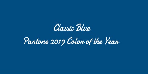
For 2020, they’ve come up with Classic Blue 19-4052. They characterize it as a “reassuring presence instilling calm, confidence and connection.”
It’s also a bold and striking choice not for the faint of heart.
So was last year’s color of Living Coral 16-1546

And 2018’s pick of Ultra Violet 18-3838

2017 was no slouch with bright Greenery 15-0343

In 2016 they chose two colors - a sort of boy/girl theme with Serenity 15-3919 (blue) and Rose Quartz 13-1520 (pink.)

I can’t say if they’ve influenced enough people to make a difference. I haven’t seen it in design trends in North Shore homes in Winnetka, Wilmette, Kenilworth, or Glencoe. But AdPro magazine wrote:
“. . . Pantone’s color forecasts are the reigning authority for a multitude of industries.”
Pantone claims that the color is already being used in fashion, interior design, textiles, and graphic design.”
So maybe this is the year we repaint the deep red-colored dining room in Pantone's 2020 Classic Blue, stand back, and await the applause. Or maybe just wait till next year.
While you're here, take a look at ALL NORTH SHORE HOMES FOR SALE
Sign up to get monthly North Shore real estate news delivered to your inbox.
It's free, we'll never sell your info, and you can opt-out at any time.
Enter your email address at: North Shore Newsletter
Margaret Goss is a full-time real estate broker since 1998 working in the North Shore communities of Winnetka, Wilmette, Kenilworth, Glencoe, Northfield, Glenview, and Evanston.
She can be reached at:
Phone: 847-977-6024
Email: margaret.goss@bairdwarner.com
See her full BIOGRAPHY


Comments(7)