Special offer

Apprentice Style Design Competition. You be the Judge.

By
Real Estate Broker/Owner with Northern Virginia Homes - FRANKLY REAL ESTATE Inc


Ever wanted to feel like Donald Trump?

Well I decided to finally break down and redesign my FranklyMLS.com site. Initially I wanted to KISS, Keep it Simple Stupid with the design. Have it be DATA driven and ultra fast. Actually not ONE graphic or Icon on the entire site (except photos of homes).

So with my redesign... I went to INDIA.

Initially I was going to hire 2 or 3 designers and see what they could do. But after I put up a request for proposal, everyone wanted a crack at it. Turned into an Apprentice style competition.

I gave each designer 2 hours (WITH PAY) to do their thing, and I gave them some guidelines to not use graphics and make it lean. Also that my favorite color was purple.

Their design prices ranged from $5 an hour to $15. (Except the USA designer for $65)

Will you be the judge? Tell me which ones your like?

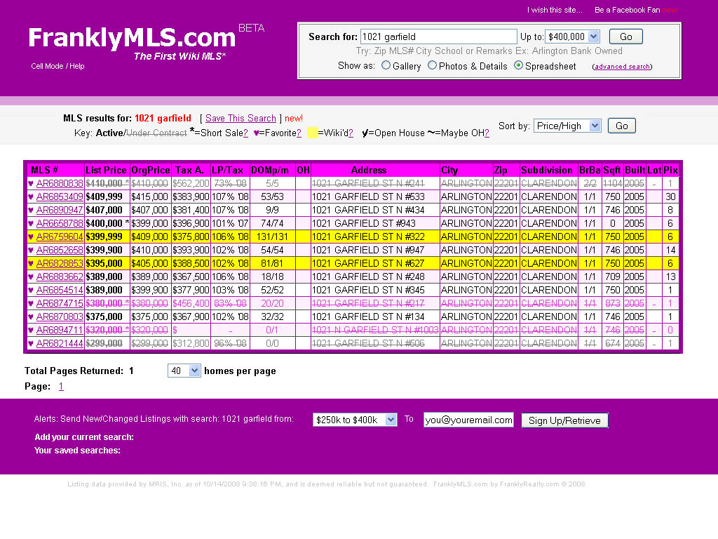
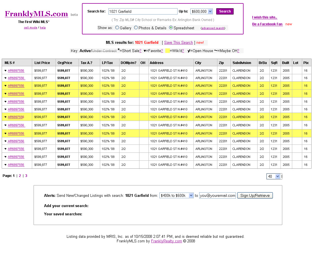
Here is the original design that I made: Search for 1021 Clarendon on FranklyMLS.com
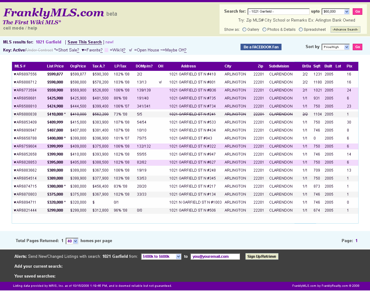
----------

#1 ALDI

----------

#2 Alwin:

----------

#3 Atul

----------

#4 Keane

----------

#5 Sandeep


----------

#6 Prat

----------

#7 Dolly= Fired for using a graphic and doing the wrong page.

----------

#8 Cath

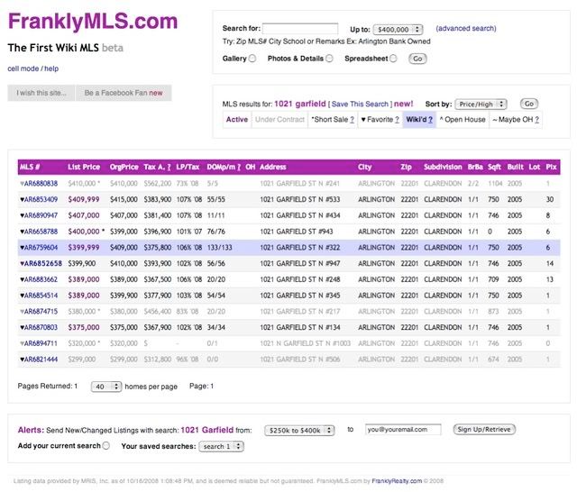
What do you all think? Who is best? The goal is to convey the concept of a fast and lean site.


Frank

Anonymous
Peggy James-Erick and Company of Exit 1st Choice Woodbridge VA

Hi Frank,

I really liked how #1 looked, however the colors are very harsh. (yuck!)  Why? I like how the search content is boxes, how a consumer can visually see what is Under Contract and Wiki'd as well as how a saved home  has gone Under Contract ( very cool) a good motivating visually. 

 My second choice would be #6 Softer on the eyes.

Oct 19, 2008 11:13 PM
#20
Anonymous
#3

I think simple is better.  Nothing fancy.  #3

Oct 20, 2008 07:53 AM
#21
Anonymous
Number 2

I vote for number 2. Easiest to read and navigate

Oct 20, 2008 09:02 AM
#22
Anonymous
Julia Spencer

#6-- IF the font gets changed to something more defined.


I love your site as it is--information is what I am looking for, not to be wowed by design!

Oct 20, 2008 11:45 AM
#23
Anonymous
Janna

I like #3.

Oct 20, 2008 02:25 PM
#24
Deborah Lint
Realty Associates - Meriden, CT

Frankly, I like # 2 seems to be the easiest to read.


Oct 20, 2008 03:14 PM
Anonymous
Meg

I like Prat #6 and Alwin #2

Oct 21, 2008 02:46 AM
#26
Anonymous
Jamie Morningstar

Frank I Love your website and thank you so much for wanting to keep it fast by eliminating the graphics. That's one reason why we keep coming back to your site. It is fast and uncluttered.

  1. I like the colors and I find the fonts easy to read in the list part. But the headings seem to bleed into the color a bit.
  2. Nice colors but the bold font in the list is kind of harsh
  3. I would rather see the strikethrough for the under contract listings, I know right away that its not available anymore. Red makes me think its a hot one.
  4. Has a nice clean look. Easy on the eyes.
  5. Nice and simple but the font especially when bolded is too thick.
  6. My favorite. The colors are not to harsh. It is more professional looking. Some men may not like the pinkish colors though.
Oct 21, 2008 03:44 AM
#27
Anonymous
treadwell

2, 3, 5 or 8

Oct 21, 2008 04:31 AM
#28
Anonymous
Tara

I like #4.

Oct 21, 2008 05:24 AM
#29
FRANK LL0SA Esq.- Northern Virginia Broker .:. FranklyRealty.com
Northern Virginia Homes - FRANKLY REAL ESTATE Inc - Arlington, VA

Hey Jamie,

Which one are you referring to? I assume the #3 since you spoke about red for under contract.

Glad I'm not the only person that thinks the site should stay fast and icon & graphics-less.

Thanks Tara, Treadwell and Meg and Jana!

Frank

Oct 21, 2008 05:38 AM
Anonymous
Clinton

I would go with your design.  I like the simple layout, not too much action, lots of white.  I would drop the yellow color a bit to match the yellow in #5's entry.  In my experience pastel colors are good highlighters.

Oct 21, 2008 07:43 AM
#31
Anonymous
Chandra

I like #2. 

Oct 21, 2008 11:46 AM
#32
Anonymous
Jay

I like #4. The yellow highlight can be be improved or changed.

Oct 21, 2008 02:14 PM
#33
Elena Malfi
Behind Every Agent - Burlington Township, NJ

Frank,
I am a VA from NJ, I think we have corresponded once before...I would really strongly suggest putting your photo on the site.  I look at these things as though I were the consumer, and if I were on your site I'd take the information but I don't think I'd call you.  The site doesn't feel like there's a real person behind it without a photo..

Also, getting clients the sold data is a reason for them to contact you - put something in there telling them that information isn't allowed to be viewed online, but you can research that info for them at a meeting or phone conference.

Good luck!

Oct 22, 2008 04:21 AM
Debbie DiFonzo
Debbie DiFonzo - United Country VIP Realty, SW Missouri - Lebanon, MO
Lebanon MO and Buffalo Missouri Real Estate

No. 6 and No. 5 would get my vote.

Will you share how you found the designers and how you arranged for this test? Did you prepay 2 hours and they sent you what they had worked up after that?

Nov 05, 2008 01:52 PM
Magi Roth
Simply3 - Vaughan, ON
SIMPLY3

I designed my site with the same logic and get a lot of compliments on the simplicity of it.  6 & 8 are definately within KISS - I don't know why people think they need bells and whistles to keep people interested in their sites, it just detracts from the message they are trying to convey.

Nov 13, 2008 05:35 AM
FRANK LL0SA Esq.- Northern Virginia Broker .:. FranklyRealty.com
Northern Virginia Homes - FRANKLY REAL ESTATE Inc - Arlington, VA

The site is now live, mostly using the #8 design

Nov 20, 2008 01:45 AM
Yvette Smith
LONG & FOSTER - Williamsburg, VA
Realtor In Williamsburg VA, Homes for Sale

FRANK, MY DEAR,

There all quite good, but I've chosen #3.  You ROCK!

Nov 21, 2008 01:56 PM
Jon Zolsky, Daytona Beach, FL
Daytona Condo Realty, 386-405-4408 - Daytona Beach, FL
Buy Daytona condos for heavenly good prices

For me number 2, number 6 and number 8, but it is not easy, it is just the way it looks, not the way it works, so you have to decide

Nov 22, 2008 12:58 PM