The numbers from July, 2011 are out from the FMLS.
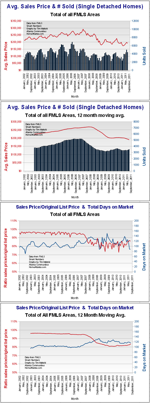
The charts below are for detached homes in the whole FMLS market area. It gives you an overall view of a large area. Atlanta is a large area to cover and it has many market areas that differ very much from one another.
You can't go by county. South Fulton County is going to be totally different than North Fulton County.
So for checking out the stats for more localized areas around Atlanta, go to my main site at HomeAtlanta.com where I have charts for 37 local market areas around Atlanta.

Comments(1)