There has been a lot of focus as of late on the importance of killer content - but one thing that typically doesn't get as much attention (but should) is fantastic formatting. In order to keep leads engaged on your website, you need to have a layout that is attractive, modern and easy to navigate. But how do you make sure you site is optimized for maximum engagement?
Follow these 5 Real Estate Website Optimization Tips:
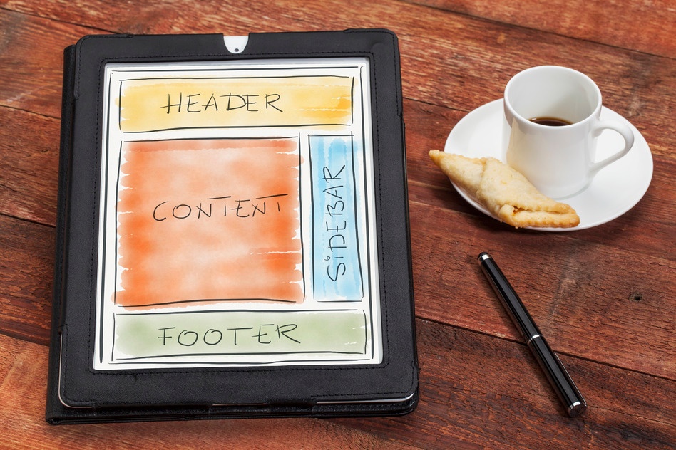
- Give Your Site Purpose:
Before you dive into your website design - you need to ask yourself some key questions that will help you identify your site's core purpose. First, you need to ask yourself what the reason for the website it. Is it simply a home search site? Is it a site designed to provide valuable content to buyers and sellers? Is it meant to showcase your successes as an agent? What type of visitors will end up on your site? What will your visitors want to do on the site? Start by asking yourself these questions - and once you've determined the main purpose of your site and your key audience, you can start to effectively build a user friendly layout.
Pro Tip: Use our free lead targeting blueprint to help identify your target audience. - Be Conservative With Colors:
You may remember when websites first become popular, color use was very bold and blocky. You'd often see patterned backgrounds with neon text, some groovy background jams and a glittery flash animation or two. Looks familiar?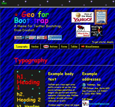
Yikes.
Unlike the busy websites of the past, today's web design mantra is "less is more." Modern websites typically either use lots of white space with intentional touches of color or large visuals that make the site pop. For best results, pick a color palette for your site that consists of no more than 2 primary colors and no more than 3 accent colors. If you choose to use large visuals, make sure any text on the page is clean and easy to read.
That's better. -
Be Deliberate With Images:
The main purpose of an image should always be to add value to your content. If you're adding images just for the sake of filling up space, take a step back and ask yourself if that's a good idea. Most of the time, the answer will be 'no'.
-
Attention-Span Proof Your Content:
Keep your copy short and sweet. Recent research shows that the human attention span is now shorter than that of a goldfish. We're only capable of paying attention for 8 seconds at a time - so make your words count.
People are also notorious scanners. We can effectively scan 7 to 11 words per sentence. Anything beyond that gets lost, so keep that in mind as you write web copy. It's also best practice to break things down into brief paragraphs or lists and to use headers when appropriate to make copy easy to read.
-
Don't forget Screen Size:
Mobile traffic has exploded, which means it has become a major consideration when it comes to optimized web design. If you have a site that is not responsive or mobile optimized, you could be disappointing as many as 80% of your visitors. Neglecting to take varied screen sizes into consideration will cause small links and blown out images to make your site extremely hard to navigate. Don't let leads go to another agent's site because yours doesn't work well on mobile.
The real key to successful real estate website optimization is paying as much attention to your formatting and layout as you do to your content. Neglecting to do so can cost you business.
Next, it's time to start driving quality traffic:
Click here to download our Free Real Estate Visibility Guidebook


Comments(5)